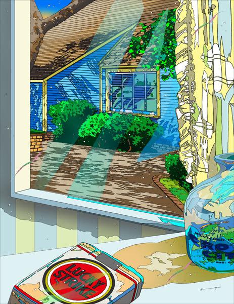
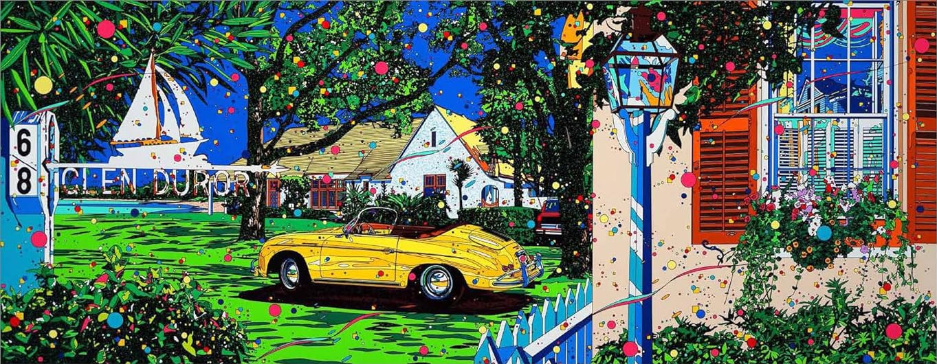
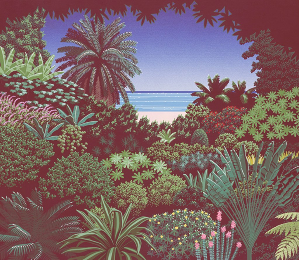
Art by Eizen Suzuki.
Those of you who have been following my Aesthetic Appreciation series might remember my first entry, in which I briefly covered Hiroshi Nagai and highlighted some of his beautiful artwork. I’ll be returning to him for a future article in this series, but before then, I wanted to cover someone somewhat similar. I say “similar”, not to diminish the individuality of the artists but rather to illustrate the parallels between the two. There’s a sort of connection or throughline to these artists, when they came to prominence, and how they are admired in the modern era. This is Aesthetic Appreciation 005: Eizen Suzuki.
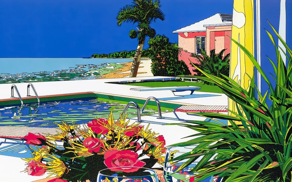
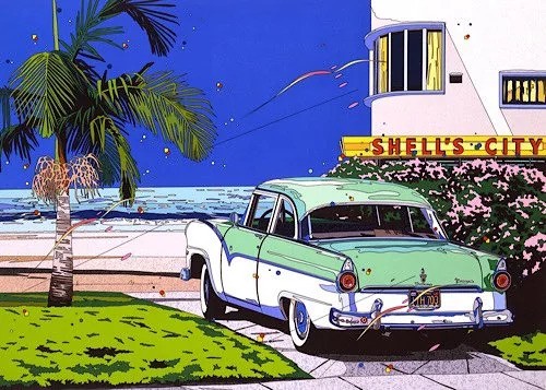
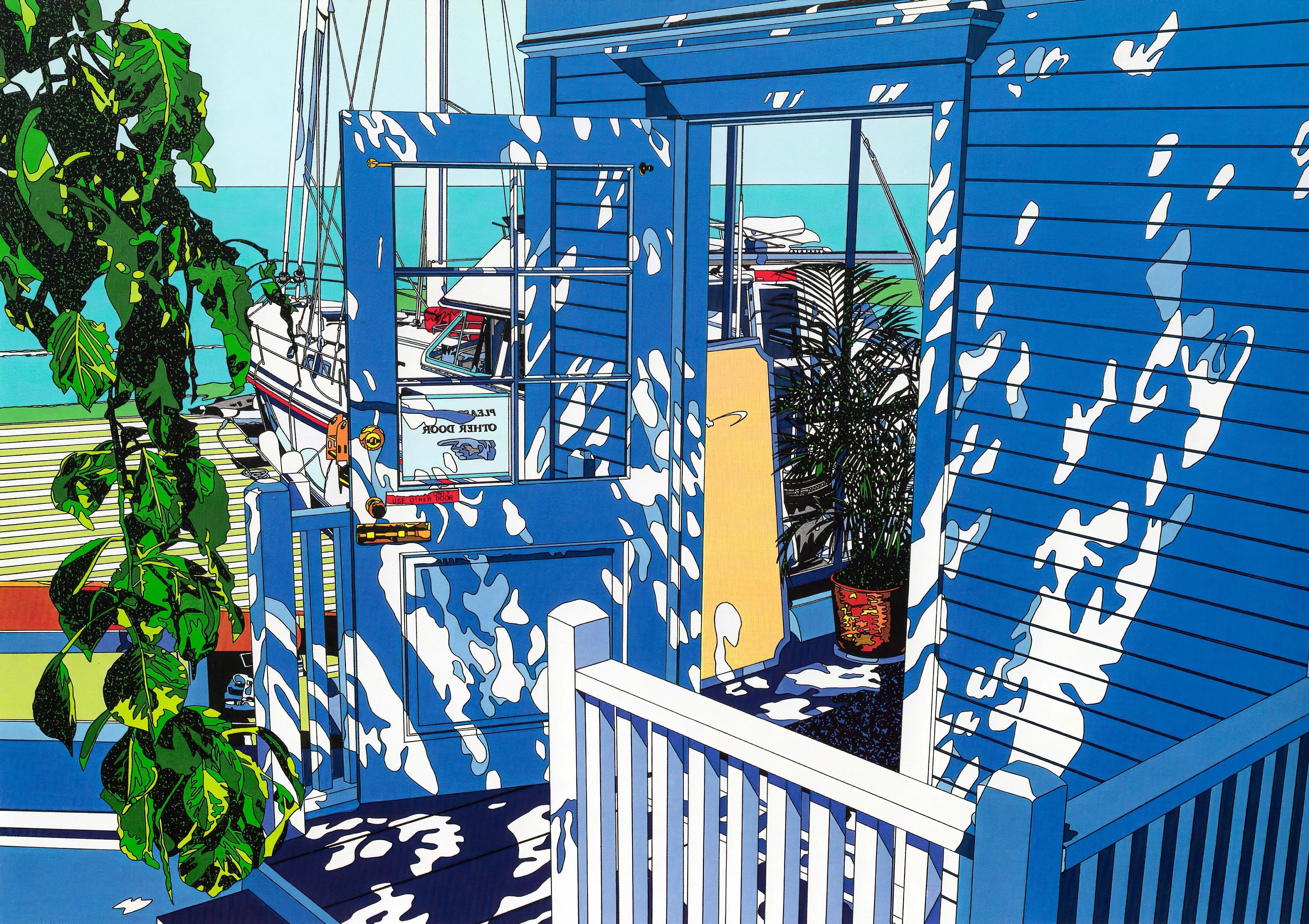
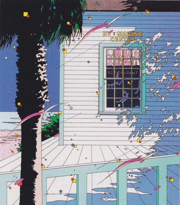
Eizin Suzuki is a Japanese printmaker known for his bright lithographs and silkscreens. Not totally unlike Hiroshi Nagai, Suzuki has a distinct and vibrant style defined by his use of color, bold lines, flat planes, and exotic locales. According to Ronin Gallery, for which he is an artist, “Eizen Suzuki began his career in advertising design, working as both a designer and art director before his debut as an illustrator in 1980. His illustration ranges from album covers to magazines”. Speaking of album covers, I spoke on Hiroshi Nagai being synonymous with the Japanese music genre of City Pop, but I didn’t mention that he was only one of the big three who crafted and popularized the City Pop aesthetic. The big three that are largely responsible for the visual cues associated with that genre are Hiroshi Nagai, Eizen Suzuki, and Hisao Kawada (another artist I’ll be covering in a later Aesthetic Appreciation entry). I’m a fan of each of these artists, and while they’re undoubtedly connected, artistically and thematically, each of them brings something unique to the table.
For all of these artists similarity, there’s no mistaking Eizen’s art. It can be hard to articulate, but there’s a celebratory quality to every piece. The use of color, dots, and strands across his various pieces gives them a festive feel. Dreamy confetti carried on the winds of spring. Take the album art for Hot Is Cool by Katsumi Horii Project or Southward Bound by Tatsuro Yamashita; there’s a jubilant air to these designs, like you’re off on a very special holiday or long overdue vacation. The lush and tropical nature of the art is buoyed by the bright and jovial underpinning. Where Hiroshi Nagai might be characterized as soft and dreamy in his approach, Eizen Suzuki is better described as vivid and sharp. The pristine and extravagant tropicalia evokes feelings of a sea breeze, sunny and warm, kissed by the ocean. Perfectly encapsulating the feeling of a spring or summer getaway, it’s easy to see why Eizen Suzuki’s art felt at home as a visual representation for the luxurious escapism of City Pop music. I’ve been a big appreciator of Eizen Suzuki for a number of years now; the pieces I’ve shared on Twitter and Instagram are evidence enough of that. Beautiful imagery like this is precisely why I bother doing this series, admiring and appreciating the aesthetic value of truly great works.
Today, Eizen Suzuki has an international following, and his works are prominently shared and admired both in galleries and online.
Follow Eizen Suzuki on Instagram.


Leave a comment